Bayesian interrupted time series with R & {brms}: Part 1/2
This post is the first of two parts. The focus here is on introducing a scenario and generating a simulated dataset, which is subsequently used for Bayesian interrupted time series modeling in part 2.
The director opens the door to your office and enters unannounced, there is a hurried look about her. She greets you, the formality ringing with stress. There is an instant expectation that a request is coming. Without sitting down she asks, “We have been asked to report on the effect of our healthcare intervention program that began two years ago.” You have not heard of the program and a dozen thoughts flutter across your mind: What data was used to measure the requirements of the program? What metrics were set to monitor the program’s success (or failure)? How long did the intervention last, or was it a single point in time? What will the results be used for and who is the audience? Looking at the director, you pause. You come to the realization that she will not know all the answers to these inquiries nor has time to answer them. Instead, you simply ask where the program details and data are located. After she directs you to the documents and data, she hastily asks, “How long will this take?”
The situation depicted above with the director is not uncommon and many will have experienced a version of this interaction. Thankfully, there are a variety of ways to respond to this request. Beyond just descriptive analysis choices, one option in our toolbox is an interrupted time series (ITS).
Interrupted time series
ITS analysis is well-suited for situations with routinely collected observational data and a clear intervention time. Furthermore, they are typically easy to explain and provide a way to easily compare to a counterfactual. In other words, the results are often easy for stakeholders to observe “what if” scenarios, such as the possible difference in outcome if the intervention had never occurred.
For this scenario we want a model with high interpretability and incorporation of casual reasoning. Selecting an appropriate ITS model is associated with how one perceives the intervention will influence the outcome, often referred to as the choice of impact model. For example, the equation below is the mathematical equivalent of a scenario where an intervention has both (a) an overall change in the level (\(\beta_2\)) of the outcome (i.e. case numbers) as well as (b) a gradual rate of change (\(\beta_3\)) following the intervention. As with all models, ITS are not perfect and come with limitations; a selection of these are mentioned in Part 2. For a more comprehensive description of ITS modeling, a selection of content is provided in the references.
\[ \begin{align*} & Y = \alpha + \beta_1(t\_since\_start) + \beta_2(event) + \beta_3(t\_since\_event) \\ \\ \end{align*} \] As an aside, sometimes this equation is represented with an interaction term between the event and overall time elapsed (\(\beta_1\)). The end-result is very similar, the main difference is a nuanced explanation of the parameter definition.
In order to fit ITS models, we will take a Bayesian approach. Using {brms}, and thereby {rstan}, we will incorporate some prior understanding of the aforementioned public health program into the model to answer the director’s query. The framework used by {brms} is both incredibly flexible and powerful. Details of Bayesian regression and fitting procedures are beyond the scope of this post, they deserve a post of their own and have been covered extensively elsewhere.
To prepare our R environment, we set a seed variable and load some R libraries.
# Assign seed for R and to later BRM fits
seed_value <- 145
set.seed(seed_value)

# Libraries
library(ggplot2)
library(brms)
Dataset conjuring
The director has provided us the program description and data. Five years ago a novel infection was identified. A new surveillance program was launched and all cases discovered were reported to health authorities and aggregated by month. Two years ago at the start of the typical respiratory season (in September) a new drug, let’s call it Drug X, was made available over-the-counter to combat the rise of the novel infection. Drug X was lauded for its success in clinical trials and would be used as both a prophylactic (i.e. preventive use) and general treatment of the disease and its symptoms.
Obviously the situation above is fictional but we can perpetuate the fantasy with some data simulation.

If you do not care about how to simulate data, feel free to skip directly to Part 2.
Simulate variables
As previously mentioned, the surveillance program has been in place for five years with the disease following a cycle starting in Autumn (as is common for many respiratory viruses). Our first step is to assign some variables to define the depicted situation.
# Variables for total time as well as before and after intervention
n_years <- 5
N <- 12 * n_years
N_b4 <- 12 * 3 # 3 years (36 months)
N_after <- 12 * 2 # 2 years (24 months)

# Monthly cycles (integer and factor)
months_int_v <- c(9:12, 1:8)
months_v <- factor(rep(month.abb[months_int_v], n_years), month.abb[months_int_v])

# Placeholder for case counts, to be simulated soon...
cases <- rep(NA, N)
With variables assigned, we can use them to create some simulated data:
months_elapsed: the number of months since the start of the surveillance program.
event: an indicator variable to delineate the point from which the intervention (Drug X) occurred.
event_elapsed: the number of months since the intervention began.
months: name of the month for each data point (as seasonality is expected).
sim_data <- data.frame(months_elapsed = 1:N,
                       event_elapsed = c(rep(0, N_b4), 1:N_after),
                       event = factor(c(rep('b4', N_b4), rep('after', N_after)), levels = c('b4', 'after')),
                       event_int = c(rep(0, N_b4), rep(1, N_after)),
                       months = months_v,
                       months_int = months_int_v)
Seasonal trend
Our populace has suffered from this novel disease for several years and it is well-known that the burden of disease has a seasonal pattern. To ensure our simulated data is representative we must include this pattern. To make the selection process easier, we create a helper function to visualize various options. The plot_seasonal_t() function will take a provided operation as input and plot the relationship over 12 months.
# Helper function for plotting possible trends to simulate seasonal variation
plot_seasonal_t <- function(trend_f, time_step = 1) {

  t_month <- 1:12
  t_month <- seq(t_month[1], t_month[12], by = time_step)

  input_length <- length(trend_f)
  ylims <- range(unlist(trend_f))

  # Setup base plot
  plot(t_month,
       xlim = c(1,12),
       ylim = ylims,
       xaxt = 'n',
       type = 'n',
       ylab = 'Seasonal Beta',
       xlab = 'Month',
       frame.plot = FALSE)
  axis(1, c(1:12))

  # Custom color palette
  if(input_length>4) stop('Only provide 4 trends at a time!')
  col_pal <- palette()[2:(input_length+1)]

  # Add lines
  for(i in 1:input_length) {
    lines(t_month,
          y = trend_f[[i]],
          type = 'l',
          col = col_pal[i],
          lwd = 1.75)
  }

  # Add ref lines
  abline(h = 0, col = 'grey', lty = 'dotted')
  abline(v = 9, col = 'black', lty = 'dashed')

  # Add legend
  legend(x = 'topleft',
         legend = c(paste('Beta option', 1:input_length), 'Typical Season Start'),
         col = c(col_pal, 'black'),
         lty = c(rep(1, input_length), 2),
         bty = 'n')
}
Since the seasonal pattern is cyclical, an obvious choice to represent this trend are trigonometric functions. However, these may not have enough varied shapes for our liking. For more complex patterns, we define an additional harmonic function (custom_harmonic()); in this instance, the outputs resemble shapes generated from a Fourier series. Typically a Fourier series is to convert a periodic function into the sum of sine and cosine functions.
# For easily making a few more flexible options (Fourier series)
custom_harmonic <- function(steps = 1:12, k = 1, sinA = 1 , cosA = 1, period = 12) {
  inside_prod <- outer((2 * pi * steps / period), 1:k)
  sin_v <- t(sinA * t(apply(inside_prod, 2, sin)))
  cos_v <- t(cosA * t(apply(inside_prod, 2, cos)))

  # Sum each instance of K and then across K
  return(rowSums(sin_v + cos_v))
}
At this point you may be asking yourself, “how did we get down a rabbit hole on Fourier series?” Take comfort that the details, in this case, do not really matter. The main idea is we just want to decide on a pattern for seasonality and we are spoiled for choice. After we plot some of the available options using the helper functions it will become clearer. Below we look at four possible options.
# Higher resolution time for a smoother curve
time_steps <- sort(months_int_v)
time_steps <- seq(time_steps[1], time_steps[12], by = 0.1)

# Plot 4 options...
plot_seasonal_t(
  list(
    beta1 = 1.5 * cos((pi*time_steps / 6) - 1.5),
    beta2 = 1.5 * cos(pi*time_steps / 6),
    beta3 = custom_harmonic(time_steps, k = 2, sinA = 1, cosA = 1.5),
    beta4 = custom_harmonic(time_steps, k = 100, sinA = 1/(pi*1:100), cosA = 3/(pi*1:100))
    ),
  time_step = 0.1 # Align to input resolution
  )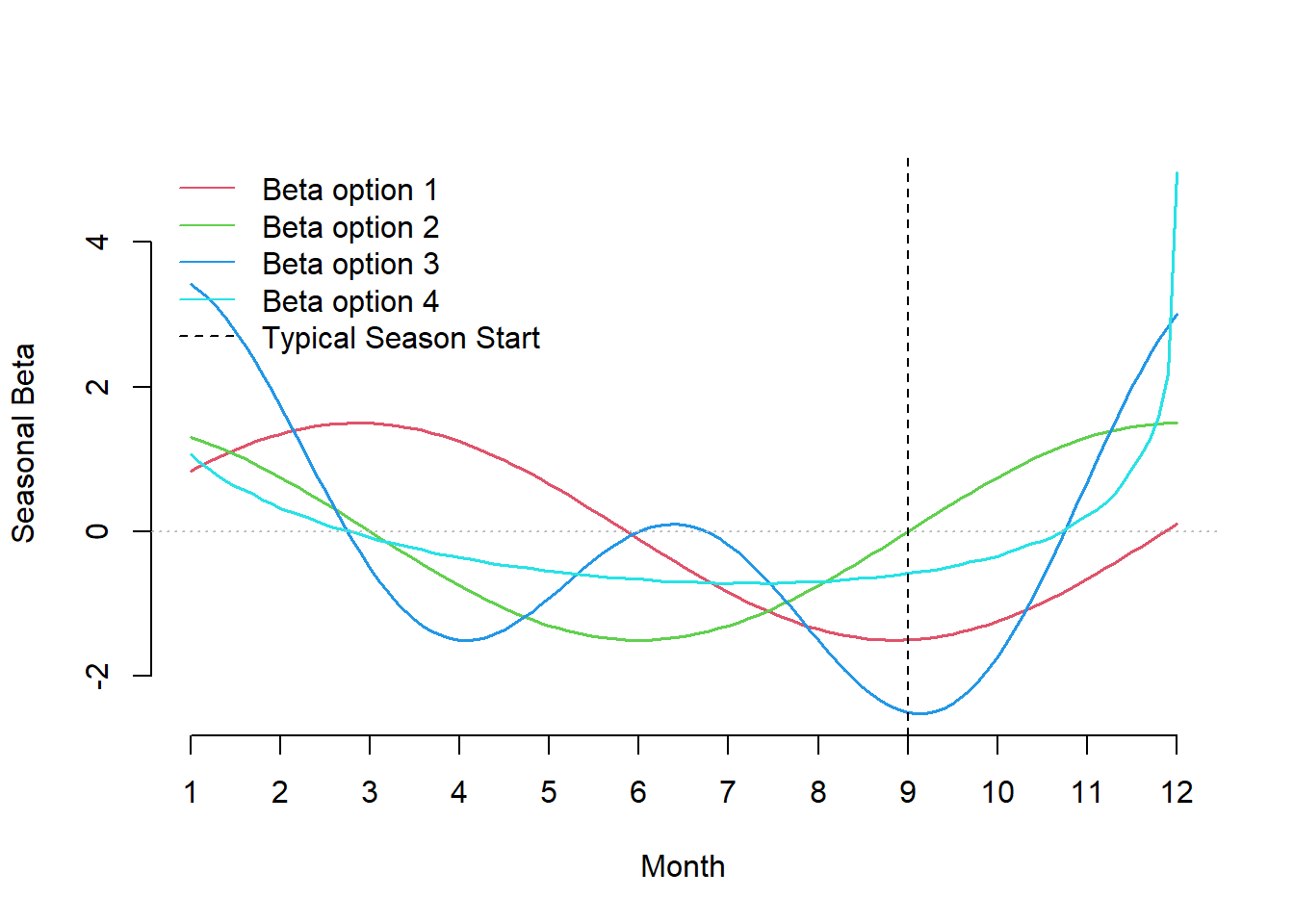
Figure 1: Possible patterns of the seasonal trend influencing case rates.
The vertical line is an a posteriori reference that delineates when cases are expected to increase. The y-axis represents the coefficient associated across each month: a higher value represents a point in time with a greater value in expected cases, as we approach zero this effect diminishes and then reverses when negative. Looking at the four curves: cyan has a slow start in September and a rapid rise and fall over the holiday season, red is more tame and it does not begin to increase in expected case rate until September. For simplicity, we will use the green pattern in our simulated data, which is simply a shifted version of the red curve.
seasonal_trend <- 1.5 * cos( (pi*sort(months_int_v)) / 6 )Simulate outcome (cases)
We now have a seasonal trend parameter describing the relationship between cases and month. However, we still need the following parameters:
alpha: the expected number of cases at the start of the surveillance period (i.e. the model intercept).
main_trend: the relationship between time and expected cases across the entire period.
after_trend: the impact to rate of change after the intervention occurred (i.e. the gradual change due to the intervention).
event_trend: the level change that occurred due to the intervention (i.e. the dip or blip due to the intervention).
# Parameters
alpha <- 1
main_trend <- 0.07
after_trend <- -0.08
event_trend <- -2
These parameters assume there is a large dip and a gradual decrease in expected cases following the intervention. In other words, the impact model we are trying to simulate is both a level change and a slope change due to the intervention (Drug X). This can be represented as a linear relationship of the following terms:
\[ \small \begin{align*} & log(\lambda) = \alpha+ \beta_1(t\_since\_start)+ \beta_2(event)+\beta_3(t\_since\_event)+\beta_4(month) \\ \\ \end{align*} \] One main difference between this equation and the one shown at the start of this post is the addition of the parameter for month, which is used to adjust for seasonal effects (a source of autocorrelation in the data). Together these variables estimate the expected value (lambda) for a Poisson distribution, from which we use to sample case counts.
\[ \begin{align*} & Y \sim Poisson(\lambda) \\ \\ \end{align*} \]
# Simulate from trend functions
lambda <- with(sim_data,
               alpha +
               main_trend * months_elapsed +
               after_trend * event_elapsed +
               event_trend * event_int +
               seasonal_trend[months_int])

# Add simulated features
sim_data$lambda <- lambda
tmp_rng <- apply(replicate(1e5,
                           rpois(N, exp(lambda))),
                 MARGIN = 1,
                 FUN = quantile,
                 probs = c(0.05, 0.95))
sim_data$ub95 <- tmp_rng[1,]
sim_data$lb5 <- tmp_rng[2,]

# Draw a simulated dataset
sim_data$cases <- with(sim_data, rpois(N, exp(lambda)))
Examine simulated data
And with that, the data has been simulated. Here is a sample from the start and end of the time series:
head(sim_data[,c('cases', 'months_elapsed', 'event', 'event_elapsed', 'months')])## cases months_elapsed event event_elapsed months
## 1 3 1 b4 0 Sep
## 2 9 2 b4 0 Oct
## 3 11 3 b4 0 Nov
## 4 11 4 b4 0 Dec
## 5 16 5 b4 0 Jan
## 6 11 6 b4 0 Febtail(sim_data[,c('cases', 'months_elapsed', 'event', 'event_elapsed', 'months')])## cases months_elapsed event event_elapsed months
## 55 9 55 after 19 Mar
## 56 0 56 after 20 Apr
## 57 0 57 after 21 May
## 58 0 58 after 22 Jun
## 59 1 59 after 23 Jul
## 60 1 60 after 24 Aug
That was quite a lot but now we have the benefit of understanding the generative process underlying the data. This will be helpful when we see how various models attempt to fit to a data sample. Although we have a general sense from the tables, it is always nicer to see a graph. The helper functions below provide a base plot as well as prediction based geometries for the time series. These functions will be used throughout this post and the next.
# Geoms for base plot
ggplot_its_base <- function(data, n_years) {
  ggplot(data, aes(x = months_elapsed)) +
    ylab('Counts (n)') +
    xlab('Month/Seasons elapsed') +
    scale_x_continuous(breaks = seq(1, n_years*12, by = 6),
                       labels = function(x) {paste0('Season ', ceiling(x/12), ' \n(', data$months[x],')')}) + # Start at Sept
    theme_minimal() +
    theme(legend.position = 'top',
          legend.title = element_blank(),
          panel.grid.major.x = element_blank(),
          panel.grid.minor.x = element_blank(),
          axis.text.x = element_text(vjust = 5))

}

# Additional geoms for predictions
ggplot_its_pred <- function(plot) {
  list(
  geom_ribbon(aes(ymin = `Q5`, ymax = `Q95`), fill = 'grey90'),
  geom_point(aes(y = Estimate, color = 'Predictions')),
  geom_line(aes(y = Estimate, color = 'Predictions')),
  geom_point(aes(y = cases, color = 'Actual')),
  geom_segment(aes(xend = months_elapsed, y = cases, yend  = Estimate), linetype = 'dotted', color = 'grey20'),
  scale_color_manual(values = c('Predictions' = 'steelblue2', 'Actual' = 'forestgreen'))
  )
}
With the base graphic, we can add a few other geometries and a custom legend. Using the calculated lambda values, we draw a sample of case counts by month across the span of five years. The sample follows the overall trend (black line for expected value) but with some slight variation. This dataset will be used in our following Bayesian ITS modeling efforts.
# Check simulated
ggplot_its_base(sim_data, n_years = n_years) +
  geom_ribbon(aes(ymin = lb5, ymax = ub95, fill = 'Expected Value')) +
  geom_ribbon(aes(ymin = 0, ymax = 0, fill = 'Simulated Sample')) + # Dummy geom for legend
  geom_point(aes(y = 0, shape = 'Expected Value'), na.rm = TRUE) +  # Dummy geom for legend
  geom_point(aes(y = cases, color = 'Simulated Sample', shape = 'Simulated Sample')) +
  geom_line(aes(y = cases, color = 'Simulated Sample', linetype = 'Simulated Sample')) +
  geom_line(aes(y = exp(lambda), color = 'Expected Value', linetype = 'Expected Value')) +
  scale_color_manual(name = NULL, values = c('Simulated Sample' = 'steelblue2', 'Expected Value' = 'grey40')) +
  scale_fill_manual(name = NULL, values = c('Simulated Sample' = 'white', 'Expected Value' = 'grey90')) +
  scale_shape_manual(name = NULL, values = c('Simulated Sample' = 19, 'Expected Value' = NA)) +
  scale_linetype_manual(name = NULL, values = c('Simulated Sample' = 'dashed', 'Expected Value' = 'solid'))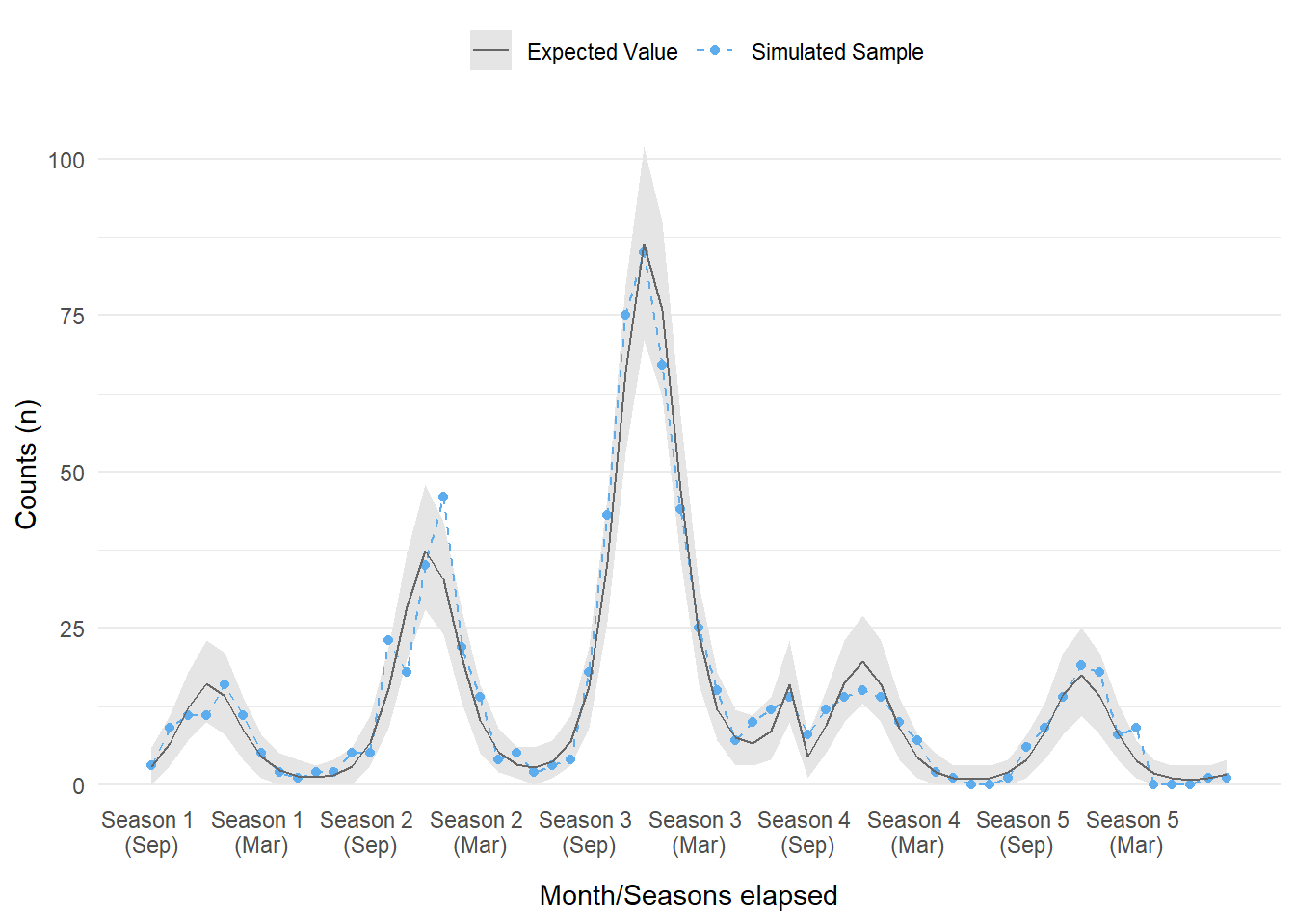
Figure 2: The modeled and simulated sample for case counts over a five year period. Each season starts in September, with season 4 being the start of the intervention.
Quick and dirty ITS
With data in hand, we may be itching to use it right away. This will be the main focus of the next post but let us take a quick peek. To this end, we can try a quick and dirty approach for ITS.
Diving too quickly into models is not usually recommended. In order to select the best modeling approach one must first understand the dataset. Since we simulated the data, this knowledge is basically a given. However, it still is a good exercise to run some very basic plots. We can use geom_smooth() from {ggplot2} to fit basic models and plot them at the same time. In this instance we will model cases over time before and after the intervention period with a Poisson distribution. This quick and dirty approach is not usually the end of an analysis but it can save a lot of time and get you thinking of modeling approaches and if it is worthwhile to pursue more advanced models.
ggplot_its_base(sim_data, n_years = n_years) +
  geom_point(aes(y = cases, color = event)) +
  geom_smooth(aes(y = cases, color = event), fill =  'grey80',
              method = 'glm', formula = y ~ x,
              method.args = list(family = 'poisson')) +
  scale_color_manual(labels = c("Before intervention", "After intervention"),
values = c('steelblue2', 'salmon')) 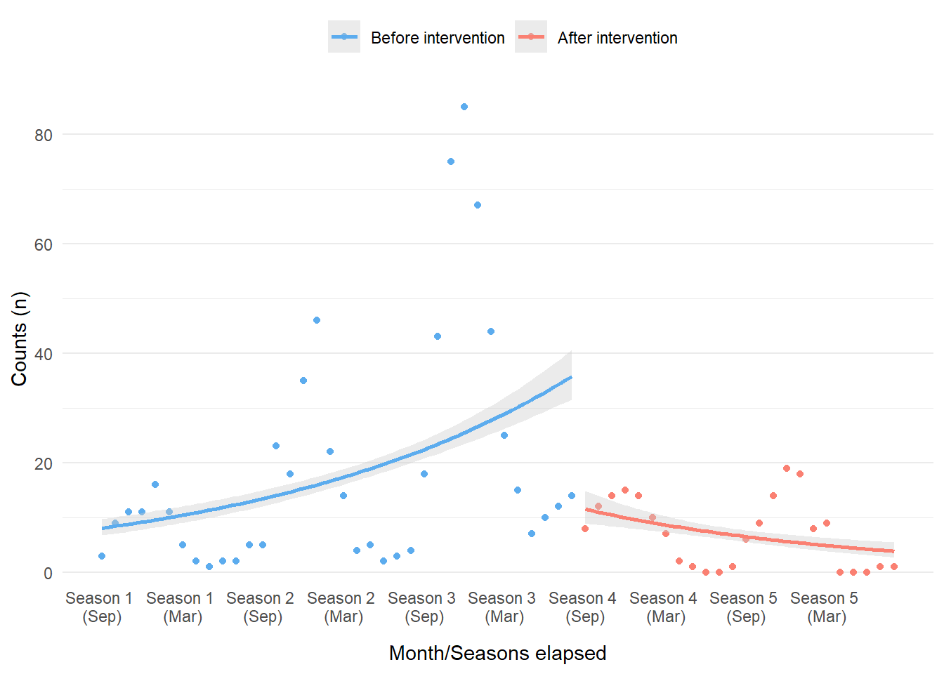
Figure 3: Simple trend lines using a Poisson model overlaid with simulated count data and color-coded by intervention period.

Whoa, that’s pretty terrible. However, we should not be surprised. This ‘failure’ is still informative, especially if we did not already know how the data was generated. What really becomes obvious is the autocorrelation between the data points over time (i.e. the fact that many of the data points are correlated to one another), which was not incorporated into this basic model within geom_smooth(). The data shape is also indicative of the strong seasonal effects. Even with the terrible performance of the model considered, there does appear to be a difference before and after intervention; this should be enough evidence to pursue further models. In our case, we will explore Bayesian ITS models next!
References
There is a wealth of content on Interrupted Time Series as well as their applications in the R language, spanning articles, textbooks, and blogs. A selection of content referenced for part 1 and part 2 of this post are below:
- Interrupted time series regression for the evaluation of public health interventions: a tutorial
- Fitting GAMs with brms
- Interrupted Time Series
- Modeling impact of the COVID-19 pandemic on people’s interest in work-life balance and well-being
- Applied longitudinal data analysis in brms and the tidyverse
- Interrupted time series analysis using autoregressive integrated moving average (ARIMA) models: a guide for evaluating large-scale health interventions
- {brms}
Allen O'Brien
Infectious Disease Epidemiologist
I am an epidemiologist with a passion for teaching and all things data.