Animating STI trends in Alberta, Canada
This post was created in addition to wider content presented for the Telus World of Science Dark Matters event.
In the summer of 2019 Alberta declared a Syphilis outbreak, with reported cases exceeding 2,000 that year. Syphilis is not the only example of rising Sexually Transmitted Infections (STIs) in the province, gonorrhea is also on the rise. This information is publicly available online via data portals and reports.
Health Surveillance
Surveillance provides a critical function to the health care system by providing evidence and feedback on performance. Additionally, surveillance can leverage information from healthcare touch-points to understand population level trends. If we pause for a moment, we can appreciate the effort required to collect, organize, and deliver data. A basic example of how health information travels from primary care to surveillance systems is presented below.
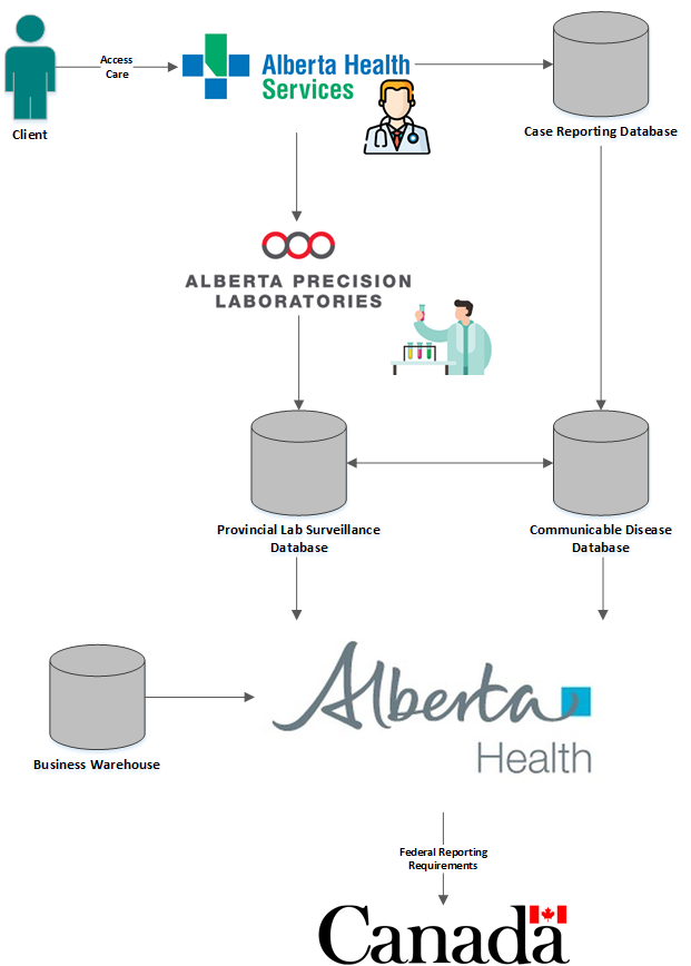
Health data flow chart.
Now that we have a general understanding of health surveillance and how data flows across systems, let’s use some data from this process to create figures and identify STI trends! All figures created below are sourced from the aforementioned publicly accessible data in the Alberta Interactive Health Data Application.
For those interested, R code used to create the figures are included in the post but are hidden by default; select code to reveal the block.
# Load libraries of interest
library(sf)
library(data.table)
library(ggplot2)
library(gganimate) # Have {av} installed as well for backend
library(stringr)

# Load annual STI data
sti_annual <- fread('sti_annual.csv')

# Load Congenital Syphilis Q data
cs_q <- fread('cs_q.csv')

# Load STI Q data
sti_q <- fread('sti_q_sz.csv')

# Load Shape Files (previously saved as binary files after loading from sf::st_read())
szone_shp <- readRDS('szone_shp.rds') |> rmapshaper::ms_simplify(.022, keep_shapes = T)
The burn returns…
Although the number of reported STIs has fluctuate since the turn of the century, recent years have exerpienced a sharp increase. Alberta recently exceeded a case rate of 70 and 100 per 100,000 for infectious syphilis and gonorrhea, respectively. The animation below highlights this trend…
# Subset data from IHDA annual STI data
sti_annual_subset <- sti_annual[Geography == 'AB' &
                                Age == 'ALL' & # Keep only totals for age
                                Sex == 'BOTH' & # Keep only totals for gender
                                `Disease Name` %chin% c('Infectious syphilis',
                                                        'Gonorrhea',
                                                        'Non-infectious syphilis'),]
# Create static version of plot
graph_rate <- ggplot(data = sti_annual_subset,
                     mapping = aes(x = Year, y = `Crude Rate`, color = `Disease Name`)) +
  geom_line() +
  geom_point() +
  theme_minimal() +
  theme(legend.position = 'top',
        panel.grid.major.x = element_blank(),
        panel.grid.minor.x = element_blank(),
        legend.title = element_blank()) +
  scale_color_brewer(palette = 'Set1') +
  ylab('Crude Rate (per 100k)') +
  xlab('Year of Diagnosis')

# Animate
graph_rate_animated <- animate(graph_rate +
                                 transition_reveal(Year) +
                                 labs(caption = "Year: {frame_along}"),
                               renderer = magick_renderer(),
                               nframes = 200,
                               width = 850, height = 575,
                               res = 150)
Figure 1: Rates of gonorrhea and syphilis in Alberta from 2000 to 2021.
Same figure again, but static…
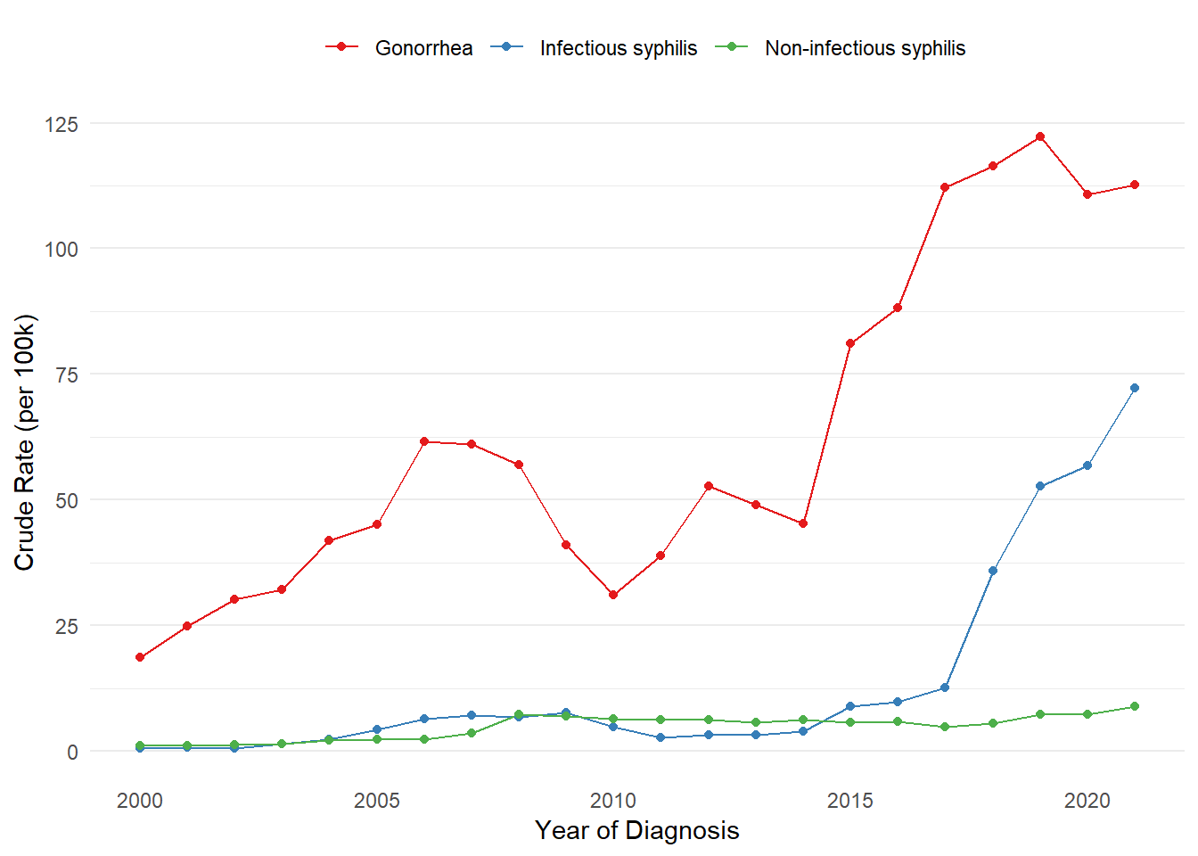
Figure 2: Rates of gonorrhea and syphilis in Alberta from 2000 to 2021.
Demographic transitions
We can also observe a clear transition in the proportion of cases among age groups and between genders over the last two decades. Most notably, you can see the proportion of females making up a larger fraction of reported infectious syphilis cases in recent years. This raises concerns about subsequent increases in congenital syphilis for women of child-bearing age.
# Subset data from IHDA annual STI data
sti_annual_subset_ag <- sti_annual[Geography == 'AB' &
                                   Age != 'ALL' &
                                   Sex != 'BOTH' &
                                  `Disease Name` %chin% c('Infectious syphilis',
                                                          'Gonorrhea'),]

# Merge in totals, assign better names after merge step
sti_annual_subset_ag <- sti_annual_subset[,c('Disease Name', 'Year', 'Cases')
                                          ][sti_annual_subset_ag, on = c('Disease Name', 'Year')]

setnames(sti_annual_subset_ag, c('i.Cases', 'Cases'), c('Cases', 'Total Cases'))

# Calculate prop
sti_annual_subset_ag[, Proportion := round(100 * Cases / `Total Cases`, 2)]

# Change Category names
sti_annual_subset_ag[, Sex := str_to_title(Sex)]

# Create static age gender plot for 2015 and 2021
age_group_plot_static <- lapply(c(2015, 2021),
                                function(x) {
                                  ggplot(sti_annual_subset_ag[Year == x],
                                         aes(Age, Proportion, fill = Sex)) +
                                    geom_col() +
                                    facet_wrap(~`Disease Name`) +
                                    ylab('Proportion of cases') +
                                    theme_minimal() +
                                    theme(legend.position = 'top',
                                          legend.title = element_blank(),
                                          panel.grid.major.x = element_blank(),
                                          axis.text.x = element_text(angle = -90, vjust = 0.5)) +
                                    scale_fill_brewer(palette = 'Set1') +
                                    labs(caption = paste0("Year: ", x))
                                }
                              )


# Create animated plot for all years available
age_group_plot_animated <- ggplot(sti_annual_subset_ag,
                         aes(Age, Proportion, fill = Sex)) +
  geom_col() +
  facet_wrap(~`Disease Name`) +
  theme_minimal() +
  theme(legend.position = 'top',
        panel.grid.major.x = element_blank(),
        legend.title = element_blank(),
        axis.text.x = element_text(angle = -90, vjust = 0.5)) +
  scale_fill_brewer(palette = 'Set1') +
  transition_time(Year) +
  labs(caption = "Year: {frame_time}")

age_group_plot_animated <- animate(age_group_plot_animated,
                                   nframes = 200,
                                   renderer = magick_renderer(),
                                   width = 850, height = 675,
                                   res = 150)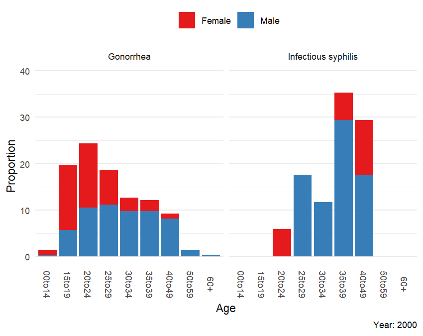
Figure 3: Propotion of cases in Alberta by disease by age and gender from 2000 to 2021.
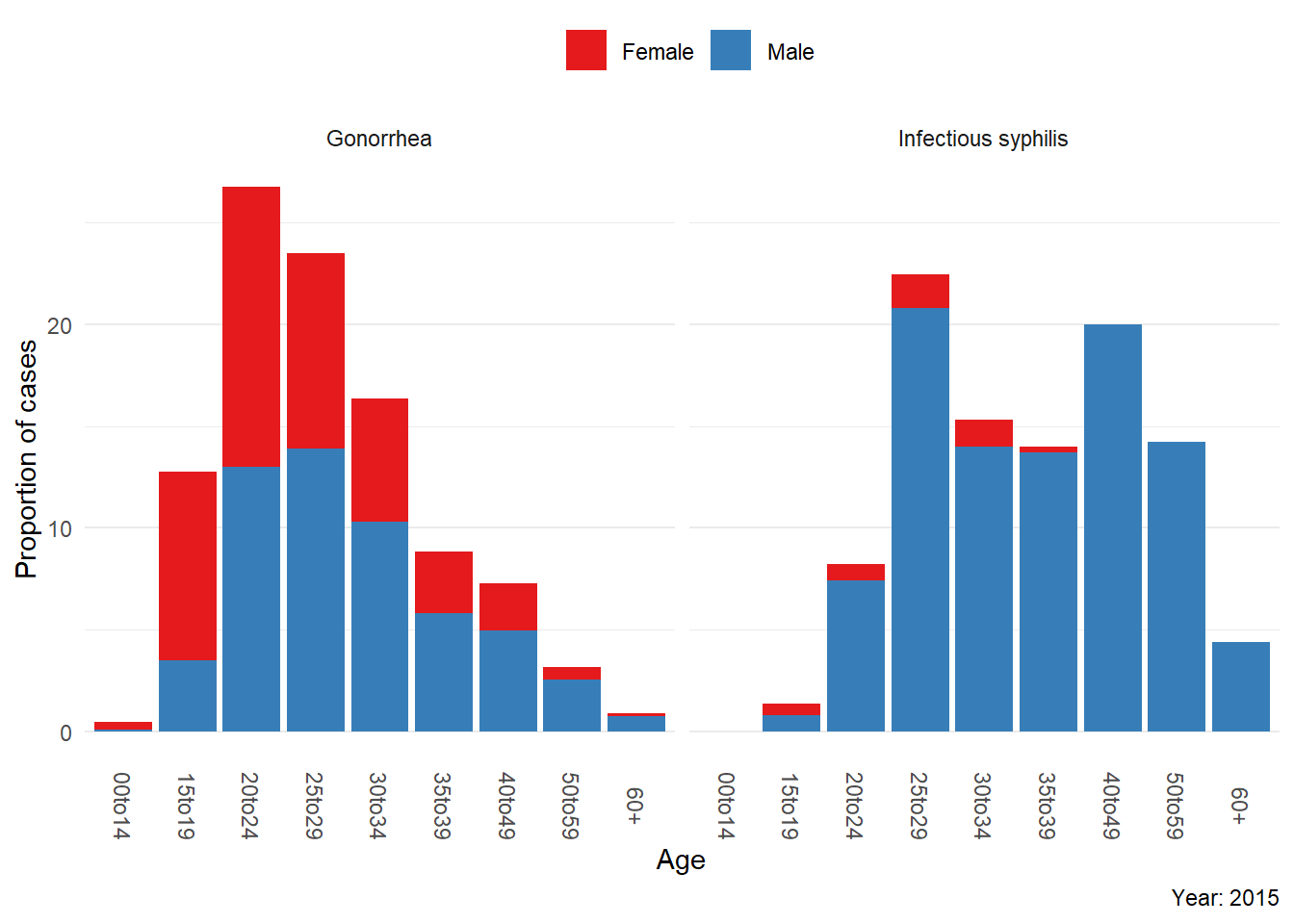
Figure 4: Propotion of cases in Alberta by disease by age and gender for 2015.
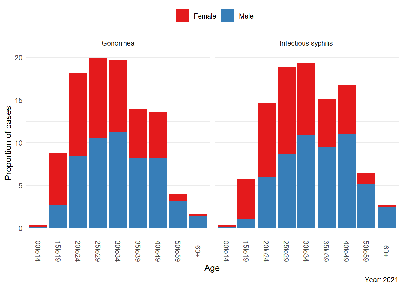
Figure 5: Propotion of cases in Alberta by disease by age and gender for 2021.
Geospatial trends over time
To understand the spread of STIs, we can use the preliminary quarterly data by Sub-Zone (Alberta Health Service regions that divide Alberta into 35 areas). The animated maps below show case counts for gonorrhea, infectious syphilis, and congenital syphilis since 2019. Pay attention to the region size as well as legend scale across each map.
# Congential syphilis by sub-zone and yearly quarter
cs_q_map_data <- cs_q[, .('Cases (n)' = sum(`Case Counts`)), by = .(Geography, Year)
                      ][!Geography %chin% c('AB', paste0('Z', 1:5))]
cs_q_map_data[, 'Disease Name' := 'Congenital Syphilis']

# Other STIs by sub-zone and yearly quarter
sti_q_map_data <- sti_q[Age == 'ALL' &
                        Sex == 'BOTH' &
                        `Disease Name` %chin% c('Infectious Syphilis', 'Non-infectious Syphilis', 'Gonorrhea'),
                        .('Cases (n)' = sum(`Case Counts`)),
                        by = .(Geography, Year, `Disease Name`)]

# Combine all STI data together
sti_q_map_data <- rbindlist(list(sti_q_map_data, cs_q_map_data), use.names = TRUE)

# Create factor from quarters
sti_q_map_data <- sti_q_map_data[, Date := factor(Year)]
sti_q_map_data[`Cases (n)` == 0, `Cases (n)`:= NA_real_]

# Link to shp file
sti_q_shp <- merge(szone_shp,
                   sti_q_map_data,
                   by.y = 'Geography',
                   by.x = 'SZONE_CODE')

# Create list of animated STI plots
color_pal <- rev(RColorBrewer::brewer.pal(n = 11, name = 'RdYlGn'))[c(3,5,7,9,10,11)]
sti_map_list <- lapply(unique(sti_q_shp$`Disease Name`),
                       function(x) {
                         ggplot(subset(sti_q_shp, `Disease Name` == x),
                                aes(fill = `Cases (n)`)) +
                           geom_sf() +
                           scale_fill_gradientn(colours = color_pal, na.value = 'lightgrey', limits=c(1, NA)) +
                           scale_x_continuous(expand=c(0,0)) +
                           scale_y_continuous(expand=c(0,0)) +
                           theme_void() +
                           theme(plot.title = element_text(hjust = 0.5, face = 'bold', margin = margin(b = 3)),
                                 plot.margin=grid::unit(c(1,0,0,0), "mm"),
                                 plot.background = element_blank(),
                                 panel.background = element_blank(),
                                 strip.background = element_rect(fill = '#00aad2',
                                                                 color = 'white'),
                                 strip.text = element_text(color = 'white',
                                                           face = 'bold',
                                                           margin = margin(t = 4, b = 4))) +
                           transition_states(Date) +
                           labs(caption = "Yearly Quarter: {closest_state}", title = x)
                       })

# Create the animations for each disease
sti_map_list <- lapply(sti_map_list, function(x) animate(x,
                                                         renderer = magick_renderer(),
                                                         nframes = 150,
                                                         width = 475,
                                                         height = 750,
                                                         res = 150))
The majority of gonorrhea cases, unsurprisingly, are in metropolitan areas. However, there are upticks in several northern regions.
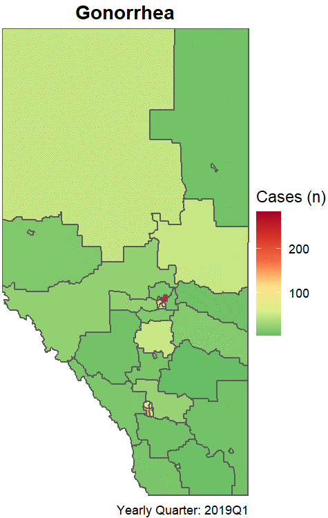
Figure 6: Case counts of gonorrhea by quarter from 2019 to 2022. Grey represents 0 cases.
The trends for infectious syphilis are similar to gonorrhea, though more pronounced. We also observe congenital syphilis cases reported both in large cities as well as many rural areas (especially in the North).
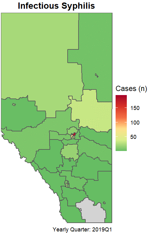
Figure 7: Case counts of infectious syphilis by quarter from 2019 to 2022. Grey represents 0 cases.
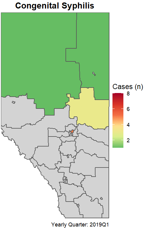
Figure 8: Case counts of congenital syphilis by quarter from 2019 to 2022. Grey represents 0 cases.
Allen O'Brien
Infectious Disease Epidemiologist
I am an epidemiologist with a passion for teaching and all things data.